
CLOUD 9
June - October 2024 (4 months)
My Role: UX Designer
Solo UX/UI Project
PROBLEM

Travel planning is too overwhelming, when booking flights, hotels, and activities
Travelers often feel frustrated by complex interfaces, lack of personalized recommendations, and the inconsistency between different apps.
SOLUTION
RESEARCH
Finding a way to achieve a full unified experience...
Multiple studies and reports reveal common frustrations within the most popular travel industry apps
A McKinsey report (2021) on consumer travel trends highlighted that personalization is one of the most desired features in modern travel apps, yet only 23% of travelers report receiving relevant suggestions.
The 2020 Travel Technology Report by Phocuswright revealed that 61% of travelers cited the need for a more unified experience, where all aspects of their journey could be planned and booked in one app.
Research on accessibility in mobile apps shows that 15% of the global population lives with some form of disability, yet many travel apps fail to meet accessibility standards (World Health Organization, 2022).
COMPETITIVE ANALYSIS
The competition has TOO MUCH fragmentation
While keeping the goal of a unified experience while booking travel, I analyzed 4 of the top apps in the travel booking industry. I found that all of them had too much fragmentation in their app. This then became my opportunity to create the solution.
RESEARCH QUESTIONS
What aspects of the travel booking process do you find most frustrating?
How many different apps or websites do you typically use when planning a trip? What do you use them for?
What features do you feel are missing from current travel apps or websites that would make booking easier for you?
When booking travel for yourself or your family, how important is personalization?
Have you ever encountered accessibility issues (e.g., screen reader compatibility, ease of use for people with disabilities) when using travel apps or websites?
How do you feel about the process of booking multiple aspects of your trip across different platforms?
What would make you more likely to use a single app to manage all aspects of your travel experience, from planning to booking?
USER INTERVIEWS
My interviewees were 3x more satisfied when booking their travel
Through my research, I found that the most common frustration among travelers was the lack of a unified experience across travel platforms. I conducted 10 interviews with parents, students, and frequent travelers. During these interviews, I asked participants about their dissatisfaction with current booking systems and what improvements they would like to see. I then organized my collected data through journey mapping to identify pain points and opportunities for enhancement.


MAIN INSIGHT
Key frustrations with fragmented booking processes and the need for a unified, personalized, and accessible travel app experience
I aimed to understand the core frustrations travelers face when booking trips. By interviewing a diverse group of parents, students, and frequent travelers, I uncovered key insights that highlight the challenges with current travel apps and the opportunities to improve the booking experience through a unified, personalized, and accessible platform
MAJOR INSIGHTS
Theme 1: Fragmented Travel Experience:
Travelers are frustrated by having to use multiple apps or platforms for different aspects of their trip (flights, accommodations, activities).
Theme 2: Usability and Accessibility Issues:
Difficulty navigating apps, especially for users with accessibility needs, highlights the importance of creating an intuitive and inclusive interface.
Theme 3: Desire for Personalization:
Users value personalized recommendations based on their travel preferences, past trips, and specific needs.
THE YOUNG TRAVELER PERSONA
27 Year old | Frequent Traveler
User Story:
Hi! My name is Alix, and I am a 27-year-old Graphic designer who frequently travels for both work and leisure. I value efficiency, flexibility, and personalization in his travel experiences. I often books last-minute trips and needs a tool that adapts to my fast-paced lifestyle. As a young frequent traveler, I want to quickly and easily book flights, accommodations, and activities all in one place, so that I can save time and reduce stress while managing both my professional and personal travel.
Goals:
Quick Booking
Personalized Recommendations
Last-Minute Flexibility
Mobile-First Design
Instant Notifications
Motivation:
Increase travel
Reduce Stress
More fluid booking experience
Pain Points:
Fragmented Booking Process
Lack of Personalization
Time Pressure
Delayed Notifications
DESIGN
Challenge of finding a new direction for unified travel booking experiences
I spent two weeks exploring different directions; Web Platform, Voice-Activated Assistant, and an app solution. After considering the practical impact, I concluded that the other options might be more of a hassle than a benefit for most users. A smartphone app could achieve the same outcome more efficiently, which is why I chose it as my final solution.
WIREFRAMES
Lo-Fi Wireframes
These wireframes helped me visualize what I wanted to change in my design as I moved forward with my Lo-Fi prototype and areas to improve

TESTING & IMPROVEMENTS
Major improvements to my design
Based on my use cases and various feedback from my peers and mentor, I continually iterated my design over the span of 2.5 weeks with 3 major improvements

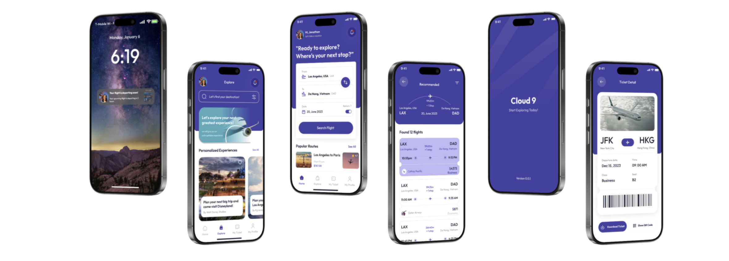
FINAL UI
The final product
CONCLUSION + REFLECTIONS
My final reflections
This was my first every UX Project! Although it took me a lot of learning and research I was so excited to fianlly take my first steps through the UX process.
Here are a few things that I learned:
The Importance of Personalization: I discovered how crucial it is to offer personalized recommendations and services that align with the user’s preferences and past behavior. Tailoring the experience makes the app feel more relevant and engaging, encouraging continued use.
User-Centered Design is Essential: Listening to user feedback and prioritizing pain points, like the need for a unified experience and flexibility, helped me design an app that solves real problems. This process reinforced how important it is to focus on the user journey and keep them at the center of the design.
Balancing Simplicity with Features: I learned that while it’s important to include a range of useful features, keeping the interface simple and intuitive is key to a positive user experience. Overloading the app with too many options can lead to confusion and frustration.
Accessibility Matters: Ensuring that the app is accessible to all users, including those with disabilities, was a significant takeaway. By implementing features like voice commands and screen reader compatibility, I was able to design an app that’s inclusive and user-friendly for a wider audience.
Iterative Design is Key: The design process taught me the importance of iteration. Testing early and often, and refining based on feedback, allowed me to continuously improve the app and ensure it truly met the needs of users.
STYLE GUIDE

FIGMA FILE
Link to my Figma file here.