Youtube Redesign
Timeline
November 2024 - January 2025 (3 months)
My Role: Solo UX/UI Designer
Overview
YouTube is the world's largest video-sharing platform, with over 2.5 billion monthly active users. While its UI has evolved over the years, certain aspects, such as content discoverability, recommendations, and user personalization; still present challenges. This case study explores a UI/UX redesign aimed at improving engagement, accessibility, and overall user satisfaction.
CHALLENGE
Redesign YouTube’s UI to Enhance user friendliness
YouTube’s current interface, while widely used, presents challenges such as information overload, inconsistent UI elements, and difficulty in accessing key features. The redesign aims to address these issues by providing a cleaner layout, improved navigation, and an optimized viewing experience.
Objectives
Enhance Usability: Streamline the interface to make navigation more intuitive and reduce cognitive load
Improve Accessibility: Ensure that the design optimally enhances readability and contrast for users with visual impairments
Optimize Content Discovery: Redesign the home feed, search results, and video player interface to facilitate seamless content exploration
Refine Visual Hierarchy: Improve typography, spacing, and button placements to create a more organized and engaging viewing experience
Ensure Consistency: Establish a cohesive design system with consistent UI components and interactions
Based on the research findings, a comprehensive redesign was implemented to create a more intuitive and user-friendly experience.
To ensure an effective redesign, a combination of qualitative and quantitative research methods was employed
User Surveys: Conducted with frequent YouTube users to identify pain points in the existing interface.
Competitor Analysis: Studied UI/UX patterns from streaming and content platforms like Netflix, Twitch, and Vimeo.
A/B Testing: Evaluated different UI layouts and interactions to determine the most user-friendly approach.
Accessibility Audits: Assessed the contrast ratios, text readability, and ease of navigation for visually impaired users.
SOLUTION
RESEARCH & METHODOLOGY
MAIN INSIGHTS
To understand the key frustrations users face while navigating YouTube, we interviewed a diverse group of casual viewers, content creators, and accessibility advocates. This research revealed common pain points and opportunities for improvement, ultimately shaping the redesign strategy. The findings underscored the need for a more unified, personalized, and accessible platform.

Theme 1: Users felt overwhelmed
The cluttered interface and excessive recommendations made it difficult to focus on relevant content
Theme 2: Navigation Was Not Intuitive
Users struggled to locate key features, such as saved videos and playlist management
Theme 3: Dark Mode Needed Refinement
Users reported that the current dark mode settings were either too harsh or lacked contrast for readability
Theme 4: Content Discovery Was Inefficient
The recommendation system often surfaces irrelevant videos which reduced user satisfaction
USER INTERVIEWS
To gain deeper insights, I conducted interviews with a diverse group of users, including casual viewers, content creators, and accessibility advocates in the design communities.
Interview Questions
What are the biggest challenges you face when navigating YouTube’s current interface?
How do you typically discover new content on YouTube, and what aspects of the experience feel frustrating or inefficient?
What features or design elements would make the platform more accessible and user-friendly for you?
When watching videos, what aspects of the video player and comments section do you find most useful, and what would you improve?
If you could redesign any part of YouTube’s interface, what changes would you prioritize and why?
PERSONA
My Learnings:
Casual Viewers:
Wanted a simplified home page with clearer video categorization
Content Creators:
Needed better dashboard integration to track video performance without excessive navigation.
Accessibility Advocates:
Suggested improvements in color contrast, font sizes, and voice command integration for better usability.
Name: Natalia Carter
Age: 26
Occupation: Film Producer
Background: Natalia is a tech-savvy content creator who uses YouTube daily for both entertainment and professional development. They rely on YouTube tutorials for software learning and frequently engage with creative content. Natalia often watches videos late at night and prefers a seamless, intuitive experience.
Pain Points:
Finds the current interface cluttered, making it difficult to locate relevant content.
Struggles with excessive recommendations that are not always relevant.
Prefers an optimized dark mode for prolonged viewing without eye strain.
Wishes for better organization of saved playlists and subscriptions.
Finds the comment section difficult to navigate when multitasking.
Needs & Goals:
A cleaner, more intuitive interface with improved content discovery.
A more personalized recommendation system that aligns with their interests.
Better accessibility options, including enhanced contrast and brightness adjustments.
A more flexible comment section that allows multitasking without distractions.
A seamless search experience to quickly find relevant tutorials and content.
WIREFRAMES
My initial digital wireframe concepts were created to explore and compare the current YouTube UI with my proposed improvements. These wireframes served as a foundation for iterating on the redesign, helping to visualize key enhancements as the project progressed.

TESTING & IMPROVEMENTS
Major improvements to my design
Over a span of 1.5 weeks, I continuously refined my design through multiple iterations, incorporating insights from use cases, peer reviews, and mentor feedback. Throughout this process, I introduced three significant improvements to enhance usability and overall user experience.

FINAL UI
The final UI for YouTube’s redesign
Balancing Simplicity & Functionality: Removing excess UI elements while maintaining essential features resulted in a more intuitive experience.
The Role of Accessibility: Even minor adjustments in contrast and typography had a substantial impact on usability for visually impaired users.
Iterative Design is Key: Regular testing and iterations helped refine the redesign and align it with user expectations.
Personalization Enhances User Engagement: AI-driven recommendations and a customizable interface significantly increased user satisfaction.
User Feedback is Crucial: Direct input from different user groups ensured the final design addressed real-world usability concerns.
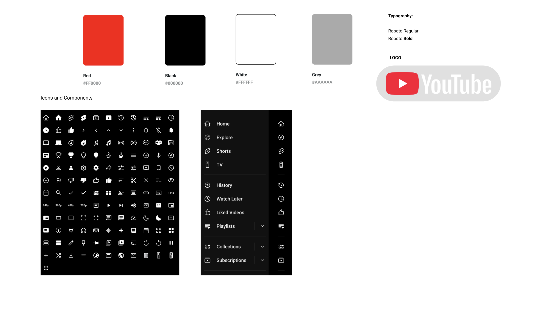
STYLE GUIDE
Streamlined Navigation
A simplified top navigation bar featuring clearer icons and an improved search experience.
A redesigned side menu with a more structured layout for quick access to subscriptions, history, and saved playlists.
Improved Video Player Interface
Enlarged and well-defined playback controls for a more user-friendly experience
.
A flexible comments panel that can be minimized or expanded, enhancing multitasking without distraction.
A refined progress bar with real-time hover previews for seamless video navigation.
Integrated video transcripts for better accessibility and searchability.

Optimized Search Feed and Recommendations
A card-based layout that clearly differentiates video thumbnails, titles, and metadata.
More intuitive grouping of recommended videos based on viewing history and engagement patterns.
AI-driven recommendations that prioritize personalized content discovery.

CONCLUSION + REFLECTIONS
My final reflections
My YouTube Redesign UI successfully delivered a more user-friendly experience by eliminating clutter, improving accessibility, and refining content presentation. The improved usability enhances content consumption while maintaining YouTube’s core functionality. Although it a lot research I was so excited to finally take my first steps on my first redesign. Here are a few things that I learned: